B.C.JAIN JEWELLERS PVT LTD, CAMAC STREET, KOLKATA
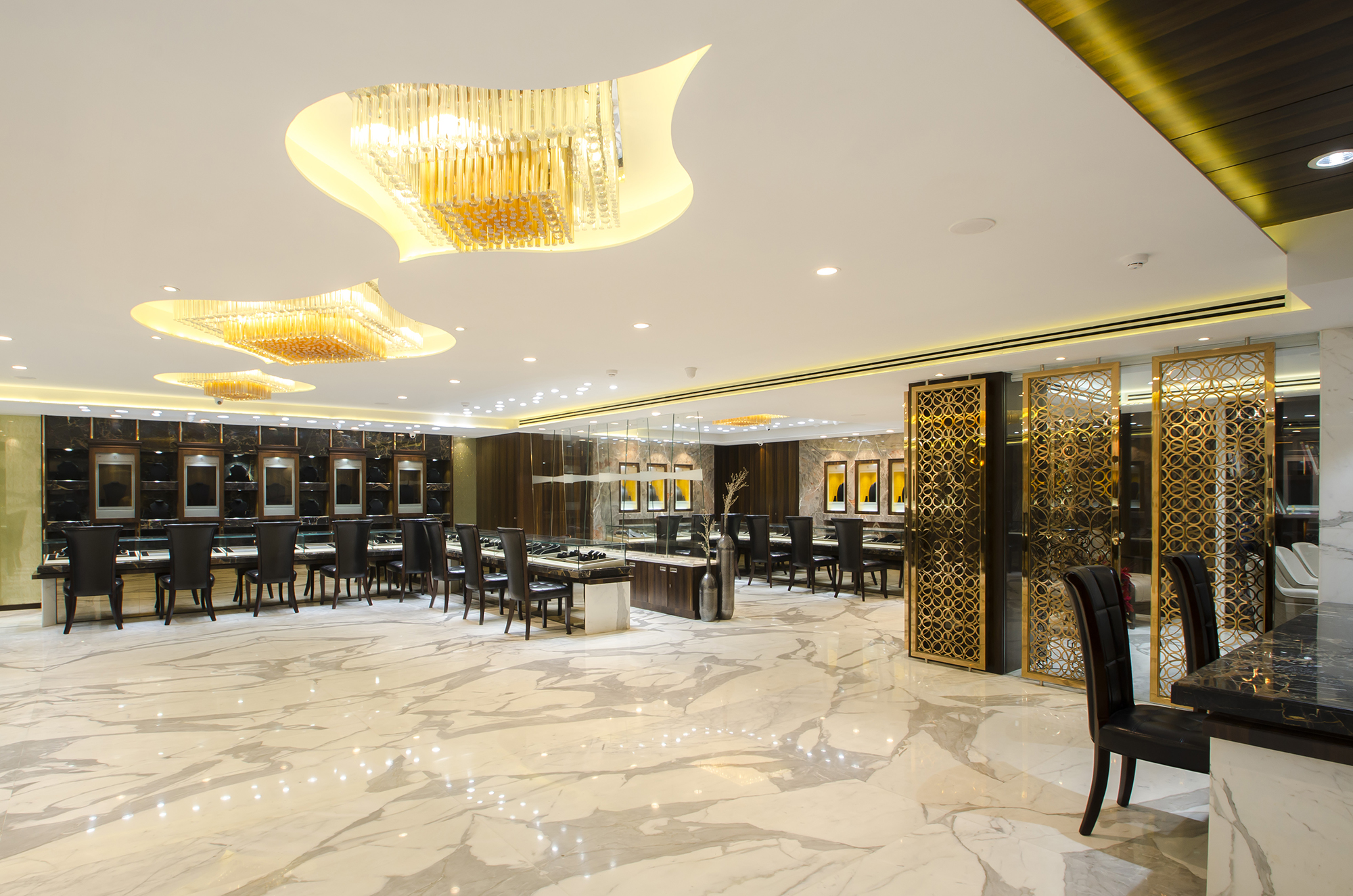
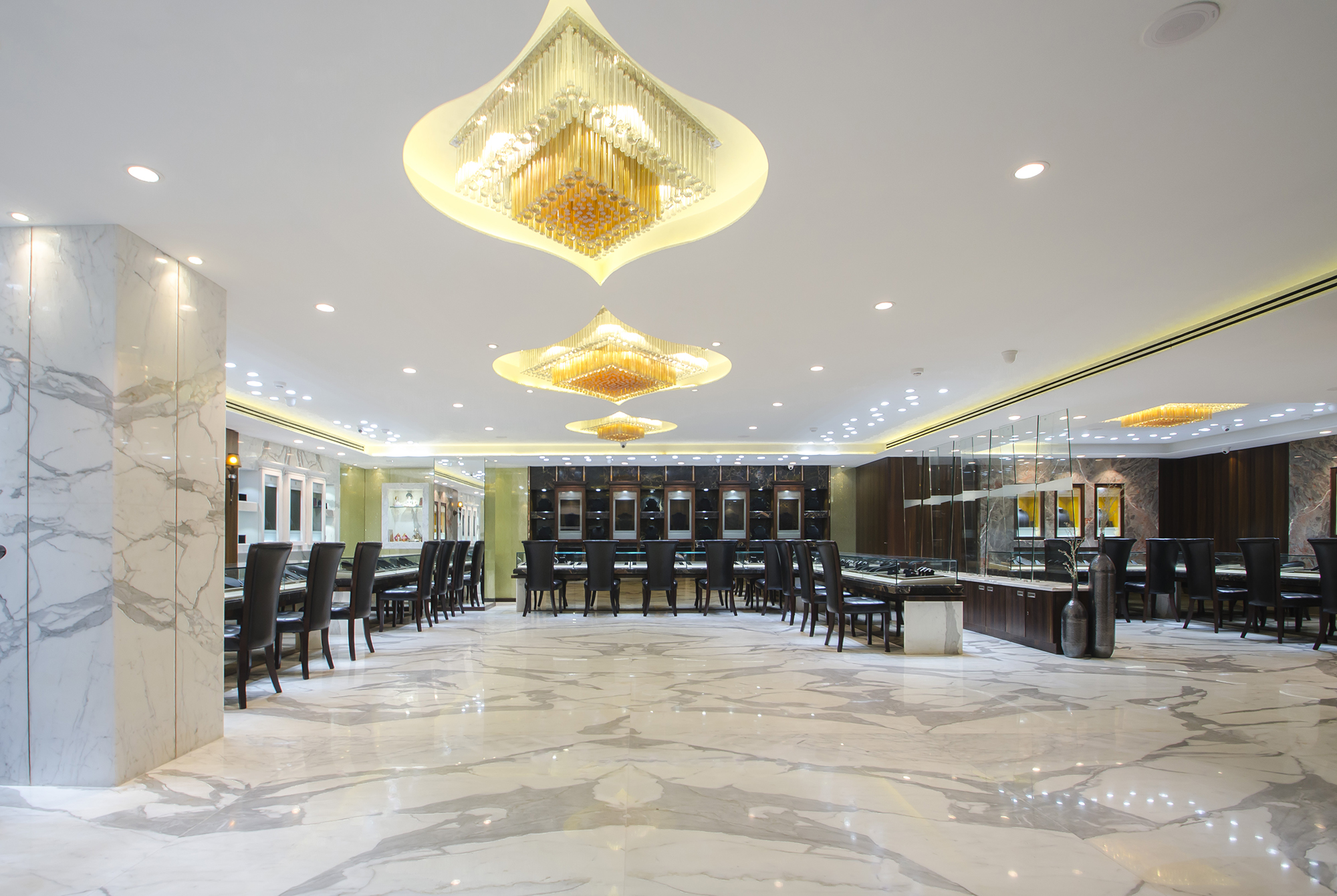
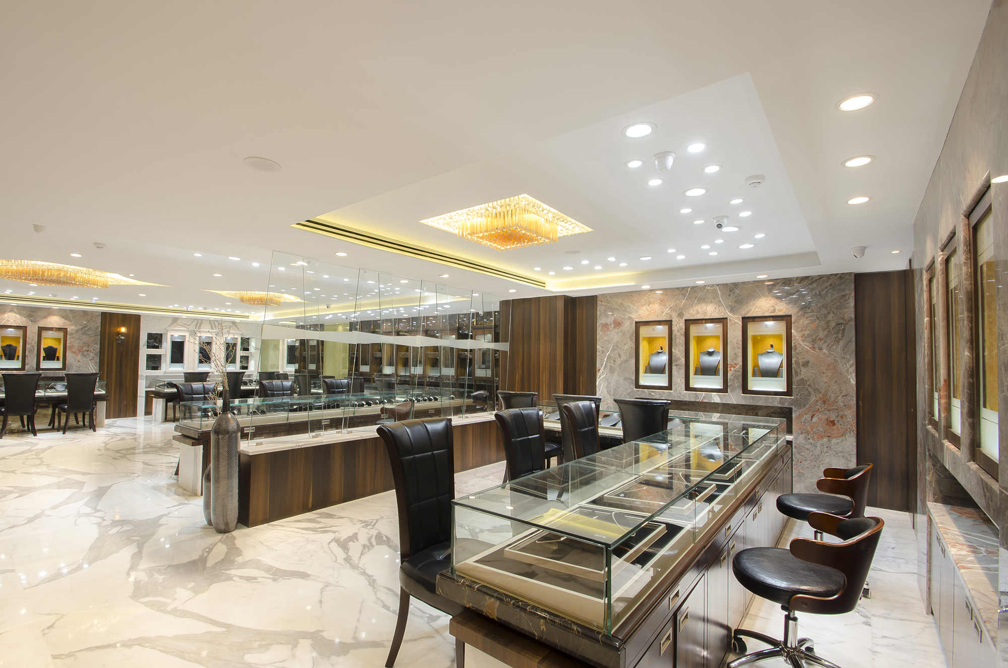
Striking a balance between contemporary design and classy elegance, formed the main theme of this high end jewellery store when the owners decided to upgrade the existing store done by us back in 2004. As a result of acquiring an adjoining space, the retail space grew bigger with the opportunity of increasing back office spaces and karigar areas of the existing store. The new store provides for an immersive retail environment with a pure and uncluttered aesthetic; mixing black, white and wood with metallic gold accents. The extensive use of marble and warm tones fused with white creates an environment of quiet luxury and quality in which the merchandise becomes the natural focus of attention.
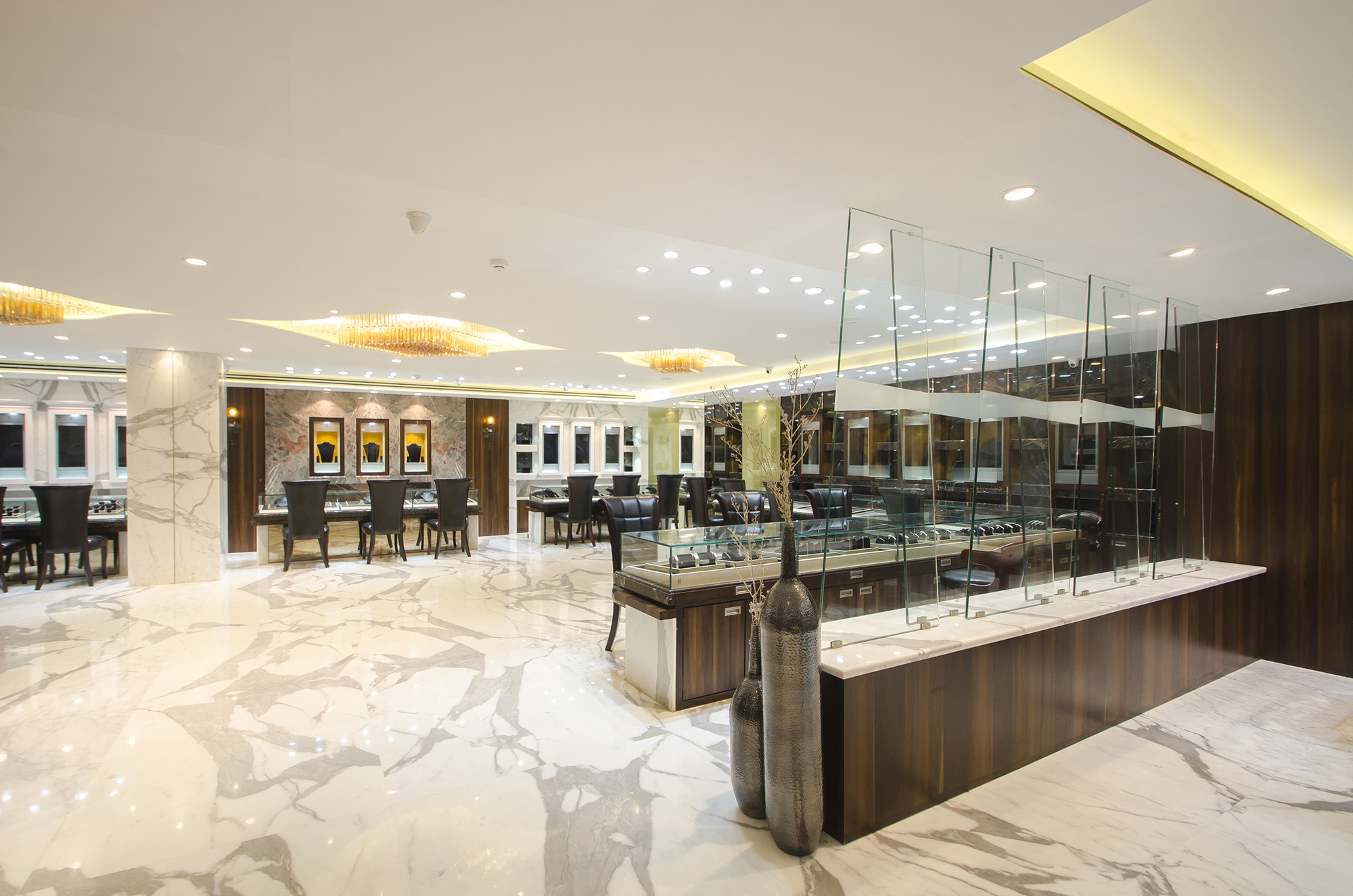
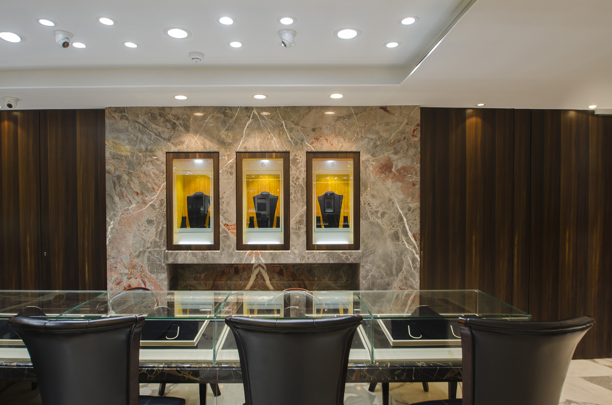
Thus, the statuario marble flooring forms the main white mass on the floor but continues itself on the walls and displays in various areas merging with the black marble and veneer. Throughout the space, a warm material palette of gold metal, white and dark grey marble with light orange display in the form of pops of colour is employed, creating a modern & welcoming vibe with a nod of sophistication.The squarish form of the retail area has been intelligently divided into roughly three parts with separate counters for gold and diamond jewellery and a screened glass cubicle to entertain high end clientele. These separations are, however, achieved with the help of glass and metallic screens that divides the space but does not create any visual barriers in between, -however, adding to the look and feel of a large space. The private cubicle oozes the vibe of a sophisticated private space.
Articulate space planning provided for separate entrances to the retail and back office areas, but with seamless connectivity between the two areas for an easy flow of activities within. The back-office areas consisted of a separate reception, meeting rooms, executive chambers, locker roomswith karigar area complete with delivery and dispatch sections, accounts, quality control and diamond assortment rooms.
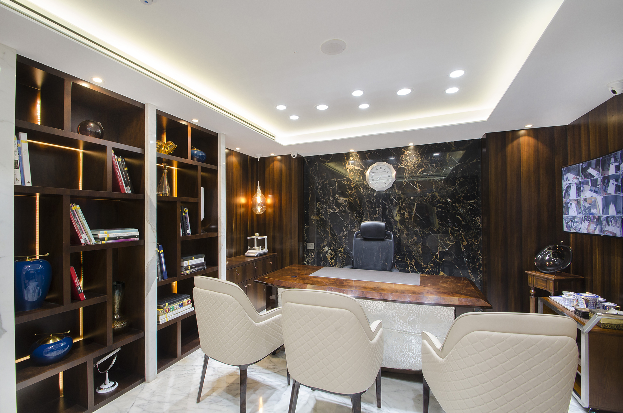
The office areas also provide for a calm and soothing but classy interior, with black marble taking centre stage as it colludes with the wood finishes in various areas. Augmenting the existing MEP structure was also given special importance in the design.
HIGHLIGHTS
Jewellery purchase in India has always had more ceremonial value other than being a high-end lifestyle product. The new showroom focusses three main design themes linked to the very basis of this practice.
Classy, elegant, uncluttered interior, that brings about the opulence and grandeur setting the tone and ambience for luxurious business. Secondly, the balance of minimalism and sophistication kept to a level of quiet luxury so that it upholds the focus on the merchandise rather than competing for attention. The harmonious balance between sophistication and cozy experience, so as to function as an elite jewellery store and provide a total VIP experience to each client, incorporating elements of security, privacy and a variety of subtly defined spaces.
The third element being the focus on creating spaces for craftsmanship, customization and curation for a smooth and luxurious experience which also became the defining part of the boutique store.
Location : CAMAC STREET, KOLKATA

